Have you tried it yet? There are some advantages to the new approach, but it is a bit of a shock! Adding text is easy, you can just type but adding photographs especially galleries is a bit of a challenge. I know there are lots of great guides out there such as How to Use the New WordPress Block Editor by WPBeginner and WordPress’s Working with Blocks, however I thought I would share a couple of things I have learnt this week.
By the way this post was going to be a Six Word Saturday but that proved impossible, still there are six tips and my title is six!
- It may seem obvious but took me a while to realise that every time you hit return a little + appears. The + is a quick way to add a different block whether that’s an image, an image with text beside or something else! You can also find + in the top left hand corner.
- If you are running a challenge or taking part in one, then check out reusable blocks. It is a brilliant new addition for inserting same text or images in future posts. You can make something reusable after you have created it by clicking on the 3 dots at the top of the lock – they appear when you move the mouse over the block.
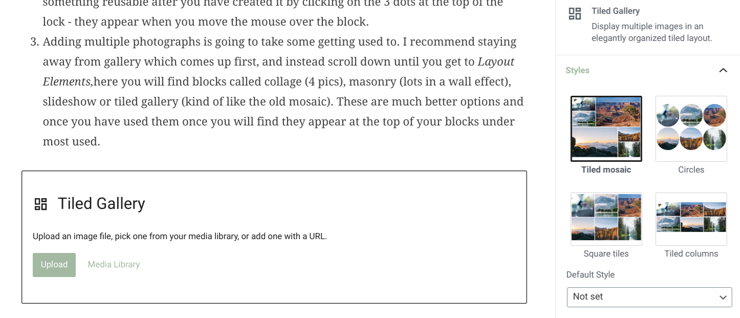
- However not so brilliant is adding multiple photographs. This is going to take some getting used to. I recommend staying away from gallery which comes up first, and instead scroll down until you get to Layout Elements,here you will find blocks called collage (4 pics), masonry (lots in a wall effect), slideshow or tiled gallery (as pictured below). These are much better options and once you have used them once you will find they appear at the top of your blocks menu under most used.


- The cog at top right are post settings. Rather confusingly when you click on this the words ‘Post’ and ‘Block’ appear. See picture above.
- Post relates to the many tasks we all do just before publishing such as scheduling time of publication, setting categories, tags and selecting featured images. If you are looking for how you adjust the text which appears on twitter when you post, that is now under JetPacks (green icon) and in the pre-publish check.
- Block are the extra settings for the particular block you are working in.
- More positive is what I found at the top of the screen to the right of bold, italic and links you will see a pull down menu option. Take a look! It has lots of really useful text options.
- And my final tip I cannot highlight enough! It’s essential to use ‘preview’ [top right] before publishing. Otherwise you, like me, might be shocked by how it looks on a mobile and tablet compared to a desktop. I spent another half hour after preview changing things!
I am learning something new every time I log in and play around with the new tools. So more tips may follow in the coming weeks. In the meanwhile I hope these few pointers prove useful, and if you have found any discoveries do share them in comments below. I think quite a few of us are going to need all the help we can get as we get to grips with the new block editor after Monday!
June UPDATE – as part of the July Squares challenge I will be sharing more tips on the extras that come with block editor in the meantime if you are looking for printable guides with step by step advice, check out Weekly Prompts developed by GC and SueW. Brian signposted me to these;
- Don’t Panic – A Simple Guide
- Don’t Panic – Classic versus Block
- Creating your First Gutenberg (Block Editor) Post
Another great place for advice and tips is Hugh’s How To page. He’s been sharing thoughts on Block Editor since March last year, and consequently is a great source of information. He has covered everything from slideshows and pingbacks to photo captions and working through the frustrations of Gutenberg. He’s also very kindly offered some tips such as creating a test post to test out the blocks on days when you have time to play. Check out the comments below for more wise words and great links from Hugh. In essence though he says;
My message is that it’s not hard to use. Just different. However, the benefits of using it far outweigh the negatives of using it.
Hugh W Roberts, june 2020
October update – They’ve been playing around with Block Editor over the summer and quite a few of the options I had got my head around have changed again. I wish they would stop tweaking it, anyhow here are some added thoughts which may be helpful. First though two photos so you know what I am about to refer to.
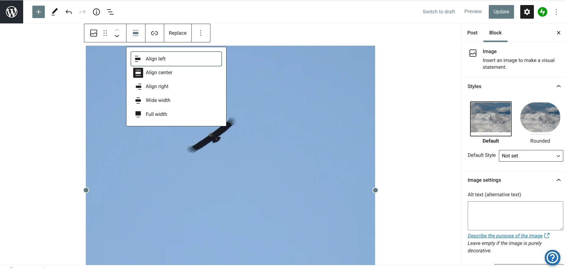

- There are two control panels for every type of block. The main one is on the right hand side of your screen. When you are working in a ‘block’ you will see a list of options on the right, or you can click on the block to bring up the options. However that is not the only control panel. If you hover the mouse over your block, a second control panel appears at the top of the block. Here the bold and italic for text now appear, it is how you can enter ‘pingbacks’ and it is also where you centre photographs.
- You may also notice when you hover over a block or click on it, two arrows in the first column in the box of symbols at the top. If you click on these you can move your block up and down the page. The first symbol tells you what type of block it is, and the six dots seem to keep that box of symbols there.
- To move photographs in a gallery you can click on the arrows which appear on each one.
- And finally if you just have a single image and then text underneath you may find that you need to add a spacer in between. Spacers are a block in their own right. The one they put in is enormous. You can make it smaller by moving the lines together, and once you have done that I recommend saving it as a reusable block. That way you can can have your own perfect spacer every time you need it.

Comments are closed.